Overview
Problems
Only 2% of users were tapping into the old data pills.
Users felt overwhelmed or confused; layout was static and irrelevant to personal needs.
Important data like pollen or UV index was often missed.
The system forced one-size-fits-all visibility, regardless of user intent or routine.
Research & insights
We studied three key segments:
health-sensitive users, casual checkers, and power users.
Through a mix of app reviews, interviews, scroll depth tracking, and heatmap analysis, we uncovered recurring friction points across different user types.

Jordan (29, Atlanta)
Allergy Sufferer
Uses the app daily to check pollen levels before commuting. Pollen info affects medication, bike route, and whether they go outside at all.
Uses the app multiple times a day. Rarely scrolls—expects to see key data at the top. The app keeps changing pollen index position.

Priya (36, Phoenix)
UV-Sensitive Parent
Has lupus. Relies on the UV index to determine if it’s safe to be outdoors with her children. Adjusts her schedule and protective gear accordingly.
Health-critical UV data is hard to find. Tabs or menus make her feel overwhelmed when time is tight.

Leo (41, Seattle)
Time-Conscious Commuter
Tech consultant. Doesn’t customize—just wants a clear, trustworthy snapshot of wind, rain, and temperature before walking his dog and heading to work.
Only checks the app in the morning and evening. Doesn’t customize. Notices when the app changes or loads slowly.
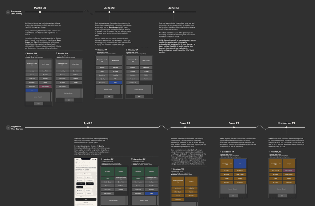
We mapped daily routines, decision-making moments, and stress triggers (e.g., unexpected pollen spikes).
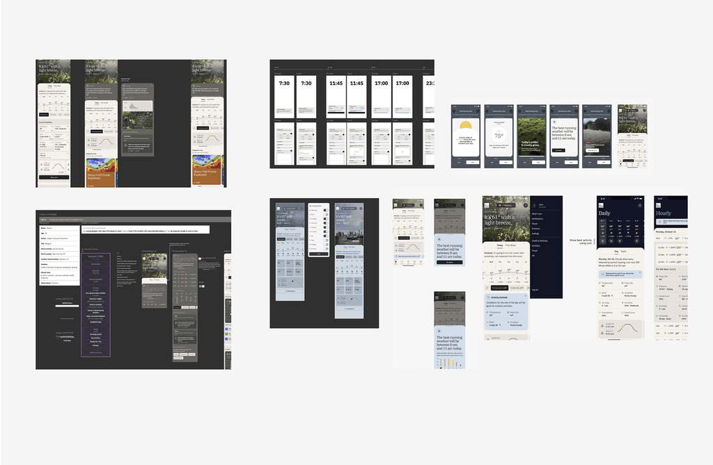
Sketched concepts—from vertical cards, customizable modules and header widgets to a AI-integrated summary.
Concept test
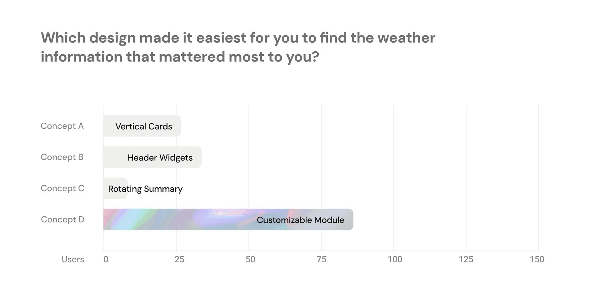
We ran a concept test with 150 users.
Most resonated with modular layouts that felt customizable yet structured.
Findings
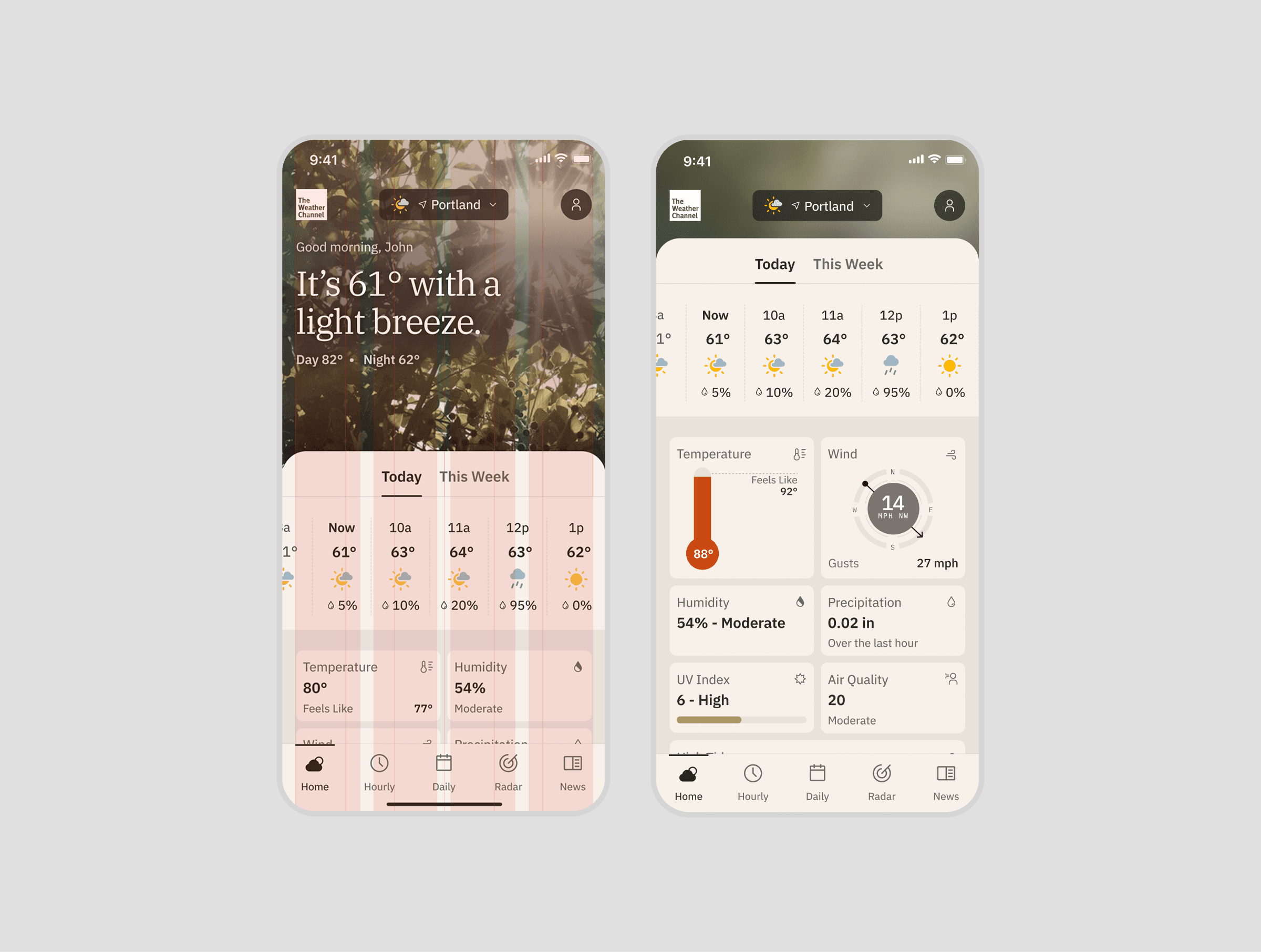
UX Strategy & Modular Framework
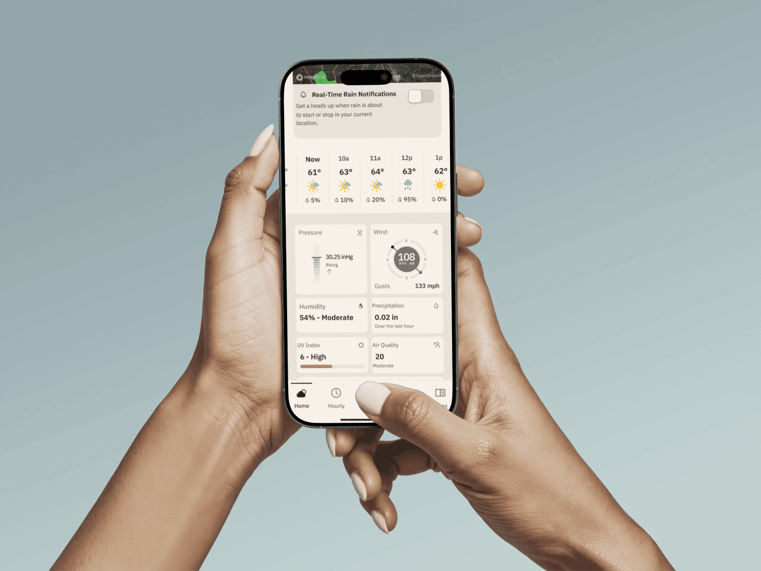
Introduced modular “chiclets”: small, tappable cards with expansion
Relevance First
Default layout adapts based on user behavior, location, and season, surfacing pollen during allergy season or UV index in high-sun zones.
Customization
Users can rearrange and pin their most-used data points. This light customization gives a sense of control without requiring deep setup.
Contextual Depth
Each chiclet expands in place to reveal just-in-time information, reducing context switching and
cognitive friction.
Scalable System
This design creates a future-ready foundation for smart alerts, health modules, and deeper customization.

Impacts
84% of surveyed users said the experience felt “more relevant and engaging.”
Engagement with the module jumped from 2% to 45% as users actively customized their experience.
Reflection
Redesigning the weather checking experience prompted me to look beyond aesthetics and explore user behavior more deeply. This project highlighted that personalizing user environments can significantly enhance engagement, which soared from 2% to 45%. It showed that the system was aligning with users instead of working against them.
I learned that invisible friction, like inconsistent data and overloaded interfaces, can undermine trust. Tools such as heatmaps and scroll tracking revealed user behaviors that interviews didn't capture, guiding us to create a solution that balanced cognitive load and clarity.
Designing for both power users, like Jordan, who needed control, and passive users, like Leo, who required strong defaults, pushed me to adopt a modular approach and simplify interaction logic.
Lastly, the project reinforced the value of early collaboration with researchers and scientists. This ensured that our solution was not just appealing but also practical and accurate. Ultimately, I gained insight into how thoughtful UX can transform legacy products into systems that truly serve users.
Project information
Year
2024
Services
iOS App, UX, Visual & Interaction Design
More work